Evaluation: Question #4
Question: How did you integrate technologies in this project?
Throughout the course of producing this entire project Me and my partner used technology in order to produce the magazine and receive feedback online from others while also sketching and planning out how we want our individual edition to look. Whether it be digital sketching or paper sketching or face to face interviews and over the phone interviews, I managed to well integrate different technologies in my project. One example is through the sketches. I would first normally draw the sketch on paper, scan it on my phone, then email it to my computer where all the heavy programs are. On my computer I would use various programs like ‘Paint.net’ and websites like Canva. Editing and small tuning took place there as well. Positively, we were provided with the computer lab at my school where almost every adobe product is built into the systems. This was great because as you may know adobe products are not cheap so having them for free at school was very beneficial. The program, though I learned it now, was too hard to navigate through so I used simpler things like paint.net and Canva. When home I used the same program “paint.net” because I already had it installed on my computer. I would then integrate that technology with the features that were limited to mobile devices. These two technologies working hand in hand allowed me to productively create my blogs as efficiently as possible.
Monday, March 30, 2020
Monday, March 23, 2020
Evaluation: Question 3
Evaluation: Question 3
Question Three: How did your production skills develop throughout this project?
Pixton Comic Q3 (That I created)
Friday, March 20, 2020
Evaluation: Question 2
How does your product engage with audiences and how would it be distributed as a real media text?
From the start of the creation of my magazine, I thought about how my magazine could engage my audience and how it could entertain them. Due to this, I chose to create a Hip/Hop magazine with bits in high fashion because this is a broad subject that a lot of the youth at my high school can enjoy. The first time I engaged my audience was when we took a survey that asked about their preferences in a genre to what color combinations they thought looked the best. My audience even played the deciding factor in choosing the name that we would call the magazine being “GUAP Magazine.” Hip-hop and fashion were two of the most wanted genres according to my audience so I went with it. In my magazine, you can see that we talked about a lot of the things that high schoolers can relate to, like balancing your time with your passion, and the collection of clothing and accessories. I also made sure to incorporate a vast amount of slang that is not too ‘wild’ but in a way allows a reader to know what age group this magazine is targeted towards. And Lastly, with my artist’ s/model being a student in high school, it allows the audience to see someone whose situation is very similar to theirs.
In real media texts, my magazine would be distributed mainly digitally but also in print at specific locations that contain a substantial youth audience. Examples would be sneaker stores, indoor amusement parks, and things relating that include a considerable teen audience. Mainly though, I would promote the magazine online through social media because that would be an ideal place for my audience. Over time as more and more of my magazines are released, I would continue to use the youth as the foundation of the magazine and explore the hip-hop/rap industry from the perspective of the youth.
Tuesday, March 17, 2020
Evaluation: Question 1
Evaluation: Question 1
Question One: How do your product use or challenge conventions and how does it represent social groups or issues?
Response: (Prezi)
https://prezi.com/view/zKQh2gmqyTc45wa2FvB7/
Friday, March 6, 2020


Tuesday, March 3, 2020

Thursday, February 27, 2020
Cover Page: Draft

On the next blog post, I plan on adding some more stuff to the left side since it's open and bland.
Monday, February 24, 2020
Cover Page: Progress 2
I started off by creating a base to my cover page since I decided to start over.


Then I erased the background of the photo I planned on using for my cover photo.


I put it on the cover page and added my mast head. I added a white cut off at the bottom to make it look more cool so it can catch the youth's attention.


I started to add the texts and the artists' name....

and I had created a cover page I liked.
Saturday, February 22, 2020
Cover Page: Progress
Process of Creating the Cover page

Here is a snippet of me creating the cover page for my edition of GUAP magazine. I inserted two images of my artist and began to blend them so that they can have a clean look on the page. I will continue to make touch-ups and add onto the page to give it more of a magazine feel.
______________________________________________________
Process:
______________________________________________________

Wednesday, February 19, 2020


Tuesday, February 18, 2020


Thursday, February 13, 2020
Double-Page Spread: Progress


I added the text from my feature story and a picture in the other corner. The process of this layout was clear in my head. I had a view in my mind that was easy to follow but I knew would grab youth's attention.


I continued adding the text but realized that there was an empty space so I decided to fill it in with a picture.


I then added the other mini feature story to the right side of the double-page spread.
Monday, February 10, 2020
Double-Page Spread: Images


I decided to use a new set of photos for the other add-on portion of my article.


Tuesday, February 4, 2020
Table of Contents: Outcome
Table of Contents Outcome
After constant review and editing, I finally came to the final design for my complete table of contents. Originally I planned to have only a microphone on the page, but since the magazine is now focused on precisely one artist, I thought I might as well put him in the space. The design is clear and straightforward; it shows the artists and gives a couple of attention-seeking descriptions under each title. By using the phrase "Drip Check" and "Feature," it gives the magazine more of a youth-oriented mood. I did not want to add too much to the page because I wanted it to look more blank with the artist popping up at you.

Saturday, February 1, 2020
Table of Contents: Research
Magazine Table of Contents Research
So here, you can see the information I gathered while looking for inspiration for how I wanted my table of contents to be produced. First, I found a few pictures of magazines from any genre and looked at how their tables of contents were arranged. I did this mainly to be able to see the layout because, in the table of contents, there is not a lot of complexity behind it. I looked for a design that could navigate my audience to what they wanted to see.


_________________________________________________________________________________
After viewing these, I got an idea of how I wanted the page to look. It would have the microphone on the upper right of the page with the Information listed on the left. I plan to include multiple pictures of the artist to give like a sticker theme to the page.
Wednesday, January 22, 2020
Fashion Add-On Feature Story
Drip Talk:
As you know fashion plays a HEAVY role in the hip-hop industry and the youth. Designer clothes, Sneakers, and accessories are all purchased by artists and showed off in music videos, photoshoots, etc. Today's Artist just happens to be a major fan when it comes to high fashion clothing and apparel. Major Drip can be spotted in his collection of designer clothing and Nothing But Heat in his shoe collection of about 40 pairs including multiple designer pieces. Belts, bags, shoes, shirts, the Drip varies in Jetski's closet. When asked how he would describe his style in clothing he said "lots of designers, I try to invest in my Image. This is just the beginning as his collection will continue to grow more and more as his career grows.
Monday, January 20, 2020
Feature Story
Here in this post you can see the Feature Story I created for my main artist.
________________________________________
Feature Story:
Jetskii's style in music varies as he tries to not be a follower of any particular artist's flow. The projects he's created can range from Rap to R&B as you can't expect a particular flow on a new song. Out of all the pieces he's created he says his favorite song is one that has not been released yet called "Slime baby", so be on the lookout. Being a High-school rapper in Miami-Dade where almost everyone is trying to blow up somehow causes Jetskii to know that he must separate himself from the crowd as much as possible. In the name as the first to letters Nw, which stands for New wave, remind him not to follow in the same baths as others. When asked how he seeks out different opportunities, whether that be for beats or a studio session he said "Its all bout connections, if you know people who know people it will start a cycle"
______________________________________________________
Friday, January 17, 2020
Different Lighting Techniques
Different lighting techniques Research
In this post I decided to show sum of the different lighting techniques that I discovered during research.


This is useful to my magazine because these are the two main lighting techniques I will be trying to pull of when taking the model pictures of my artists. Since I use a black backdrop I want the shadows on the models to almost blend into the blackness so that the shot can look nice and so that the area full of light can pop. There is no literal reason why I chose to do this besides it is the look I wanted to go for on my magazine. Its not as if the entire page will be black and white the background is just black.
Friday, January 10, 2020
Indesign Tutotrial
In this post I chose to look into the controls on Adobe InDesign CS6 because when working at school that is a program we are able to use.
When looking for tutorials and tips I came across this website which was very useful.
https://www.agitraining.com/adobe/indesign/tutorials/working-with-the-control-panel-in-indesign
It was very useful because it explained how to use the controls that I would be needing in order to continue working on my cover page.
I must first transfer my logo and my model onto the black background then add in all the extra details and sub sections on the page.


Wednesday, January 8, 2020
Magazine Progress: Digital Sketching
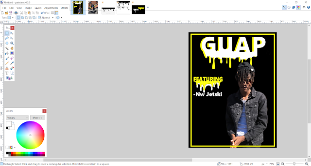
In this post i will show some of my progress while making my magazine. I will be putting things together and trying things out all on a program I have called paint.net. It is similar to photoshop but slightly easier to use and less compact. Basically i got a picture of my model. Carefully cropped him out and placed him on the cover with slight detailing. The product of the first sketch is shown.


Saturday, January 4, 2020
Completed Logo
Completed Logos For My Magazine
After a few revisions I now have my final logo completed and ready to go on the magazine. I have two almost identical choices to chose from depending on what looks best on the magazine when everything is added on.

I chose to go with this nice and simple design with the black backdrop so the words would be easier to read.
Wednesday, January 1, 2020
Working On The Final Logo
In this post you can see some of the steps that I took in order to create the Logo for my magazine.
Initially I had the logo in the previous post but I felt as if it was slightly to bland so I opened up Paint.net which was a photoshop like program that I already had on my computer and began to sketch around.


Initially I had the logo in the previous post but I felt as if it was slightly to bland so I opened up Paint.net which was a photoshop like program that I already had on my computer and began to sketch around.

After doing these two sketches I immediately decided to stick with the bottom look. So, I tried out a few other designs similar to the bottom one while switching around the colors and basically I ended up sticking with the bottom design in two different colorways.

Subscribe to:
Posts (Atom)
-
 On the next blog post, I plan on adding some more stuff to the left side since it's open and bland.
 -
Final Models/Artists Decision and Reasoning In this post I will be talking about the final two artists that i have chose to be on the mag...
